Successful web layout design depends on making it easy for the reader to easily scan and read the page to find the most important information quickly. Your website should be designed to make the reader look at content and elements on the page in the right order or the order you want them to see.
The purpose of this article is to show some of the designs and templates that MountainRiver CMS have been working with. This may make choosing a theme simpler.
Minimalism and Flat design
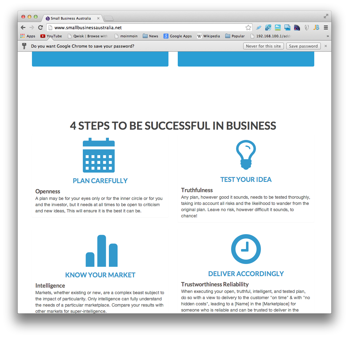
Minimalism is achieved by reducing a design to the simplest elements necessary while maintaining its functionality. Flat design is a a minimalist approach to interface design which removes any three dimensional styles such as drop shadows, bevelled edges, gradients, or textures. It involves a minimalist use of simple elements, typography and flat colors. Flat design also makes it easier to design a responsive interface.
Responsive Web Design
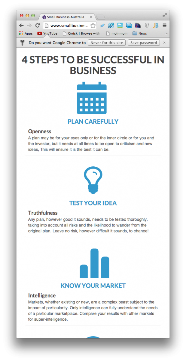
Since website use with smartphones and tablets is increasing rapidly worldwide, it is now more important to design a layout which will work on these new devices. Different considerations are required when designing for smartphones, tablets, and desktop-size screens. It is important to design a website layout so is it presented consistently and seamlessly on any device.
Newspaper
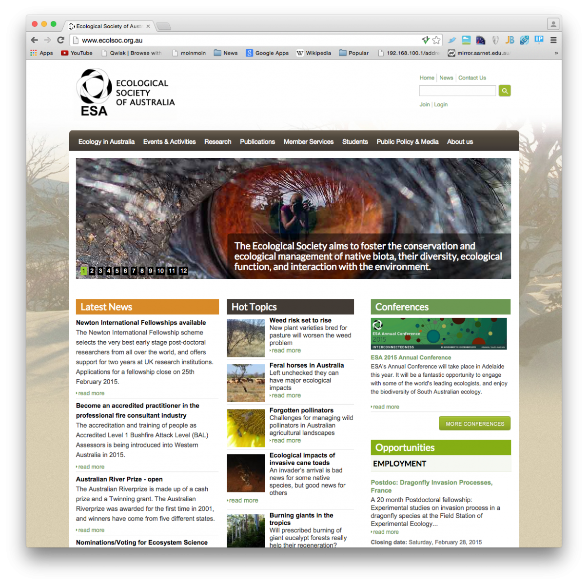
The newspaper site puts a lot of content on the homepage. This is great for people who visit your site regularly and want to scan to find out what is new. Other sites such as research institutions and academic publishers can use this effectively.
An example publishing site developed by MountainRiver CMS is http://ecolsoc.org.au.
Magazine
This is a graphic heavy interface, listing articles as images. See http://pinterest.com as an appealing example.
Corporate
Corporate has a number of derivations with varying levels of image intensity. Corporate sites directly address the questions of 'what does this business do' and 'what do you need' without too many things getting in the way. Brand is still important and the softer elements associated, but everything is aimed at a sale.
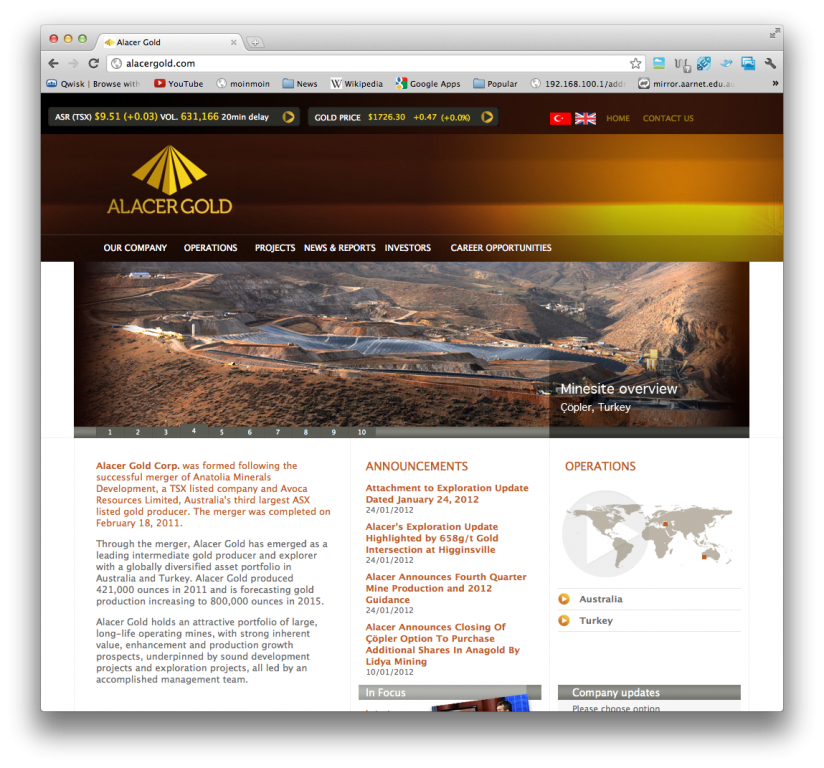
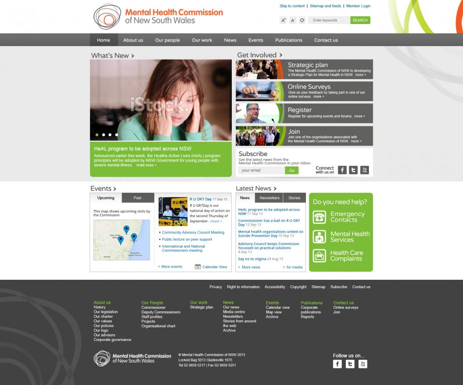
Pretty much standard, 3 column layout with slider. Here is a slightly different grid.
Grid Layout
Most content management systems have a grid concept so that 'blocks' or 'widgets' can be placed around the site without a huge amount of manual placement. It si the job of the capable designers at MountainRiver CMS to hide these details when they get in the way or you can 'go with it' and have a basic 3 or more column layout. Grids have also be formalised into frameworks that may give a distinctive style that some poeple like.
Touch Friendly and Mobile
Mobile and 'touch friendly' is a trend that is getting stronger rather than being short lived. Using your finger to navigate requires more than just resizing and repositioning to fit items on the screen as per 'responsive'. Things to be 'clicked on' need to be bigger for fingers and mobile users expect more animation and caching of pages to both indicate that something is happening and ensure that they can navigate around the site as quickly as possible.
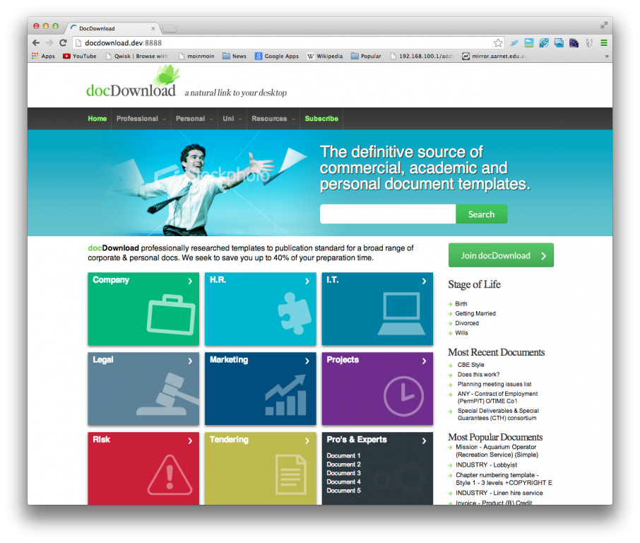
Activision contact us system required a number of mobile friendly animations.
Infinite scrolling
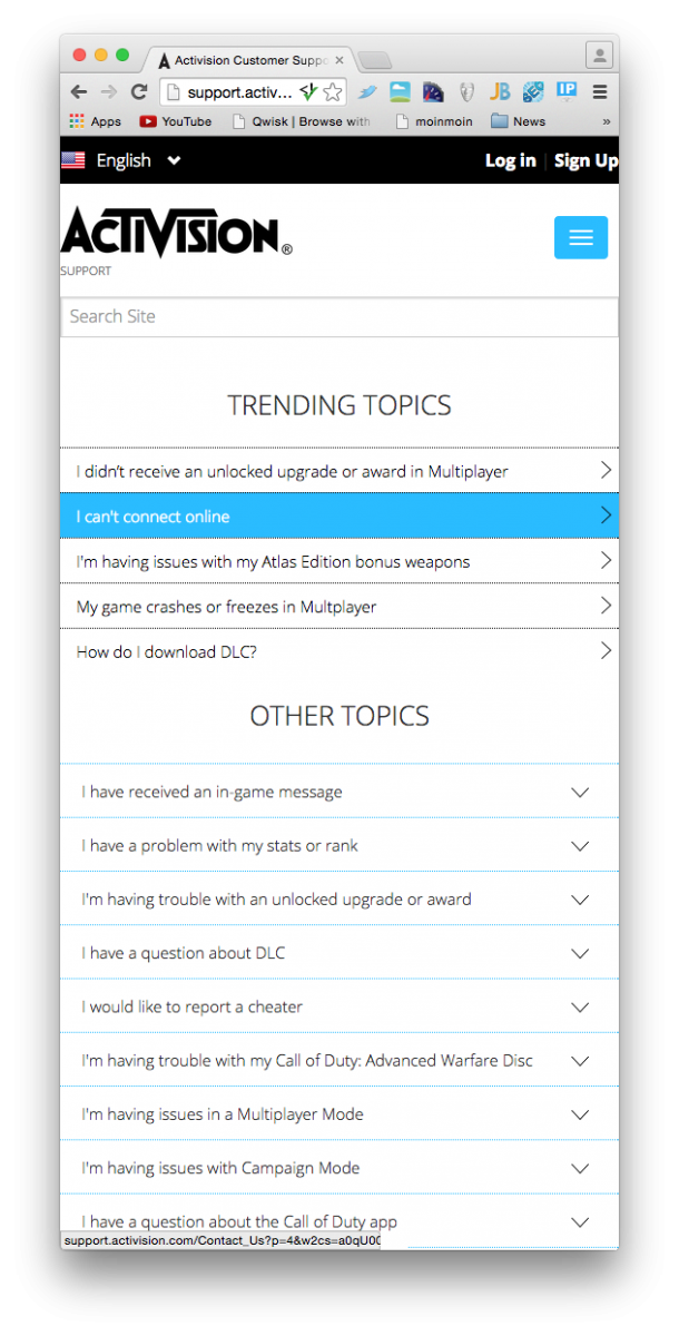
Infinite scrolling is a technique that loads content continuously as the user scrolls down the page, eliminating the need for pagination. It can give a better user experience, because more content can be loaded when the user is browsing the content currently in view. This is a useful technique when it is important that your content can be browsed easily by visitors. However it is better to use this technique if your content is mostly represented by images.
http://interlated.com.au and http://machinima.com are examples developed by MountainRiver CMS.
Some sites using infinite scrolling: Twitter, Facebook, Pinterest
Application
The web can be used to deliver applications to customers rather than information. These sites use sliders, modals, accordions etc to present as much functionality on a single page so that context isn't lost. Still the application needs to give an impression of being easy to use while providing a high level of functionality.
Photo Layout
Make a site either look like a artists See Pinterest.
Hero Image
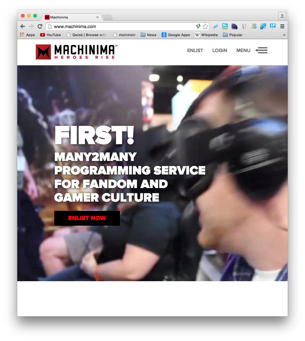
A recent trend is to display a large image or background video in the prominent front area of a homepage called the "hero area". This can be overlaid with text describing the company or product. The call to action has to be projected strongly using the image. While you are at it, why not cater for wide-screens and bleed the images out to the full size of the browser window.
Full Page Video
Full page video is for those sites where vision, imagening and 'being there' is important. It isn't for sites that are about content, or which you expect people to spend 5 minutes each morning visiting. It can look great and do wonders for your brand. The 'call to action' also needs to be very strong and presented obviously although video can project a stronger 'brand vibe'.
http://machinima.com is an example that MountainRiver CMS has worked on.
Parallax scrolling
Another trendy version try http://www.kony2012.com/
